Íslandsbanki (the bank of Iceland) is known for its great customer service, offering customers a warm welcome in every branch. But where its branches were succeeding, its decade-old website was letting it down.
Our goal was to to bring Íslandsbanki's delightful customer experience to the web. The public-facing website was given a complete refresh, achieving a more pleasant and intuitive user experience. Alongside the redesign, we built a comprehensive digital design system that allows future design work to be rolled out quickly with a consistent look to the rest of the site.
Quite a few months were spent researching, exploring, presenting, documenting, and then exploring some more. I'm going to fast forward a little and show you just some of the outputs from this huge project.
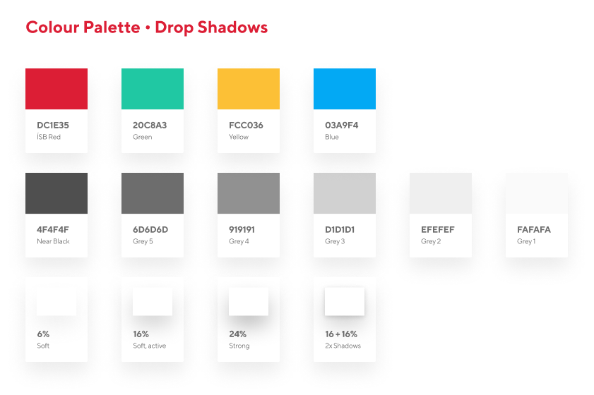
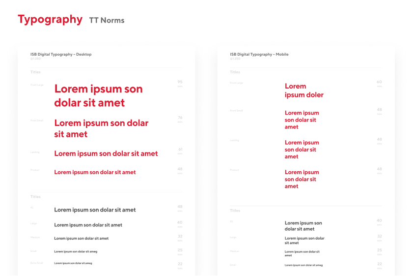
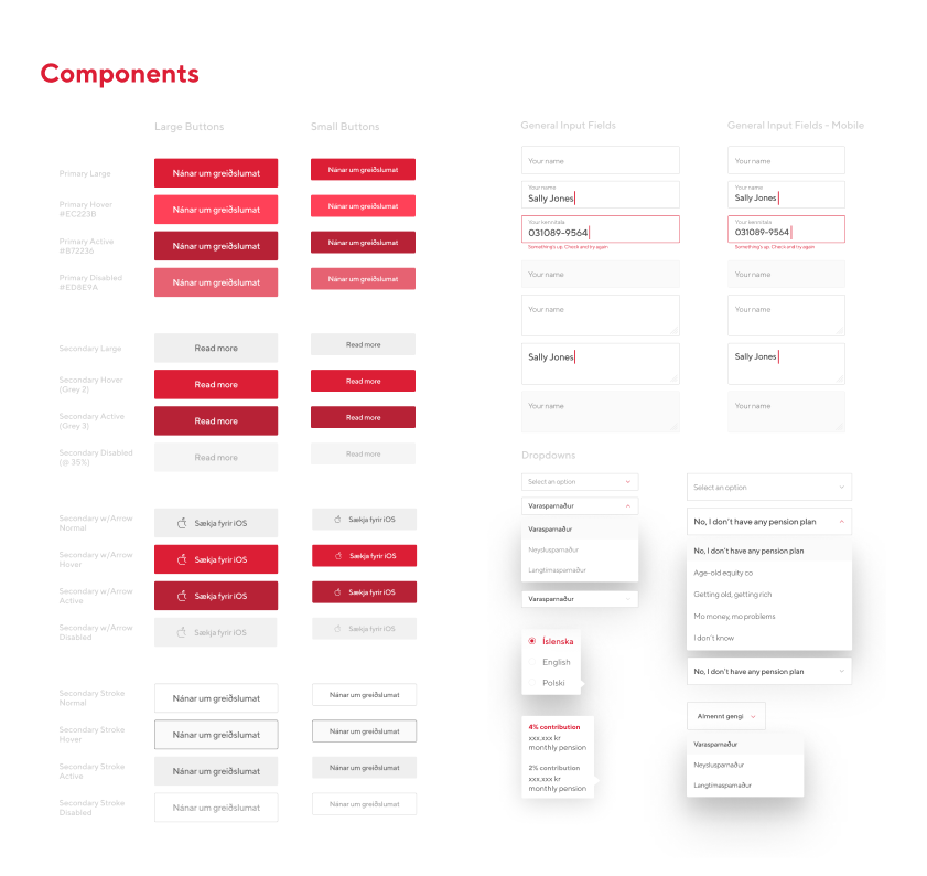
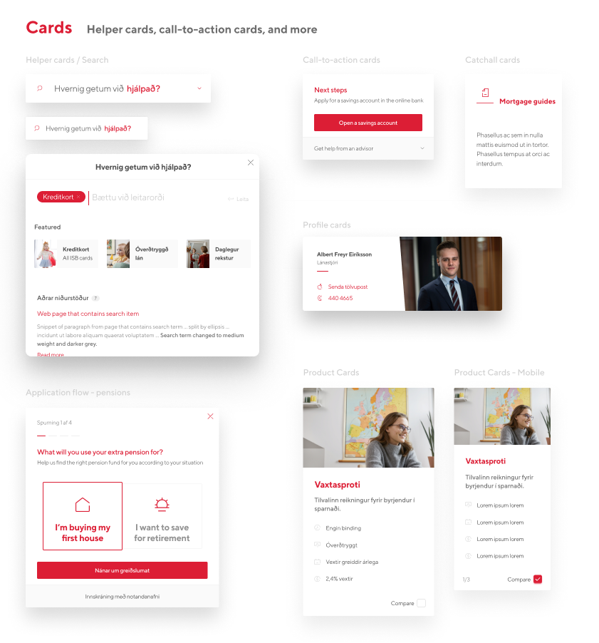
It was paramount that the design system could respond to content frequently being updated by content creators after the project handover.
The items from the digital design system form the building blocks for larger components, which content managers could use to piece together beautiful new pages to the website quickly and independantly.

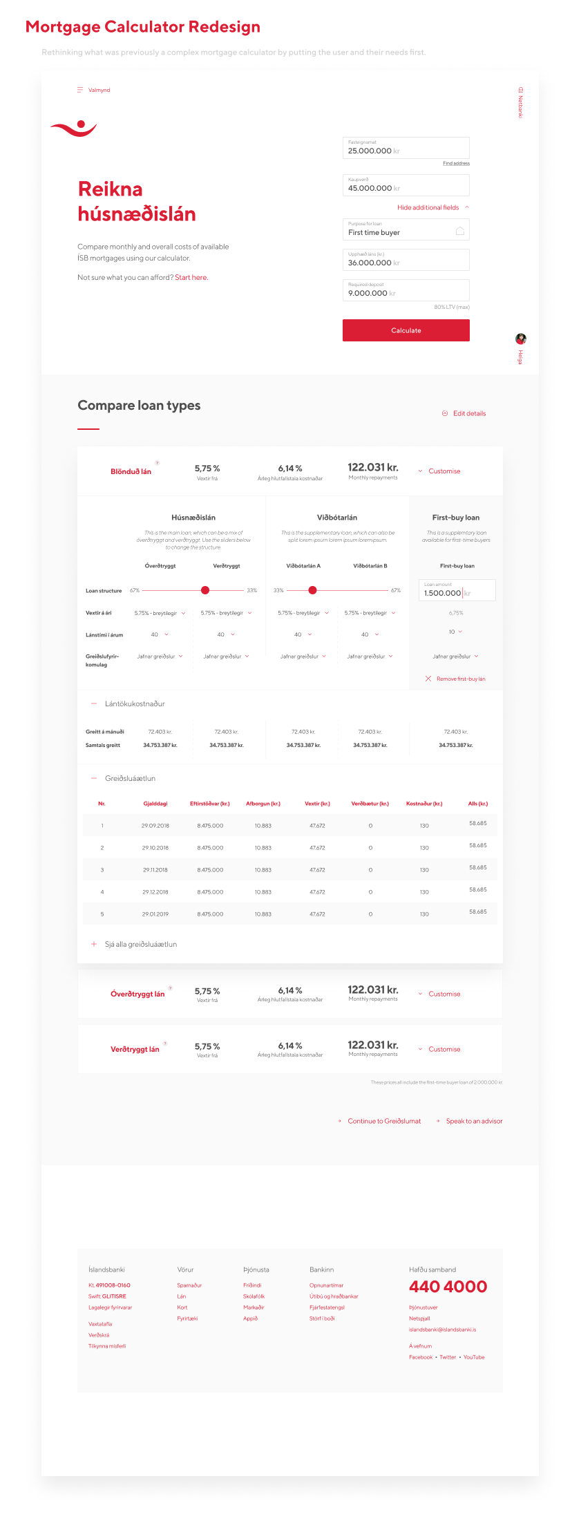
I enjoyed redesigning some of the key elements on the website, particularly those that would bring real value to users. One example of this is the mortgage calculator. I loved the challenge of transforming a complex and confusing product into something intuitive and beautiful.
See the full project live at islandsbanki.is
This was not a solo show. Shout out to the whole team who helped create this.
Steinar Ingi Farestveit // Creative Direction
Me // Design Lead
Rakel Björt Jónsdóttir // Development
JD Williams // Development
Halli Karlsson // Development
Bippi // Development
Benedikt Hauksson // Team Coach
Guðrún Skúladóttir // Product Owner & Content Manager
Eygló Benediktsdóttir // Content Manager