GRID is a smart spreadsheet with an interactive datavis layer and integrated AI assistance. Users can build interactive web documents, powered by their own data.
I had the pleasure of joining GRID as part of a fledgling design team. I joined forces with Krissa, the UX designer to move GRID from being a purely functional tool for the most spreadsheet-savvy users, to something that was beautiful and easy to use - no matter your proficiency with existing spreadsheet software.
I began my time at GRID auditing the existing GRID product design elements, ensuring design consistency and removing any superfluous components.
I built on this foundational work to evolve what was essentially a loose collection of components into a functional design system.
This also presented me with an unmissable opportunity to bake accessibility into the foundations of our user experience.
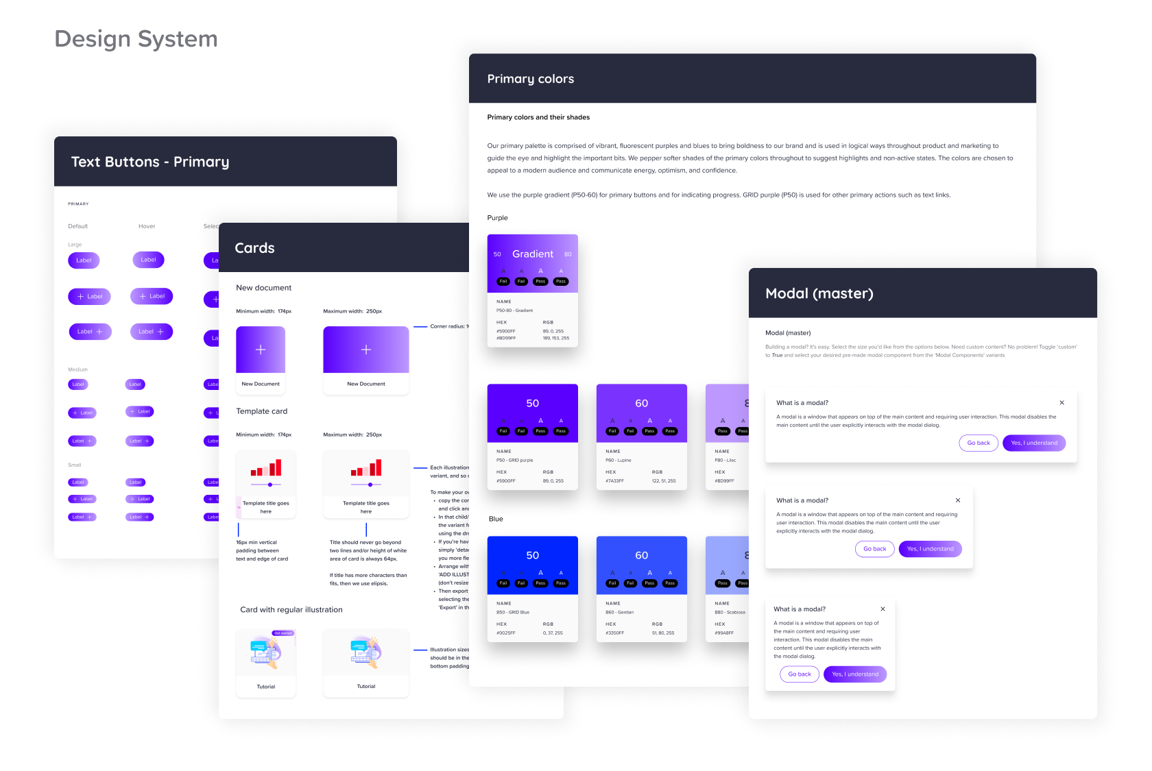
I worked with Krissa on totally reimagining the product user experience, including three key product KPIs for product growth: the onboarding process; building the first GRID document; and sharing said GRID document to the world (or more privately, if the case may be).
As our target audience of Gen Z + Millennials (~20-40yo) became better defined, it was evident that a rebrand was essential for increased product adoption. I led what was a complete UI overhaul of the GRID product, affecting every touchpoint, elevating overall product usability and brand quality.
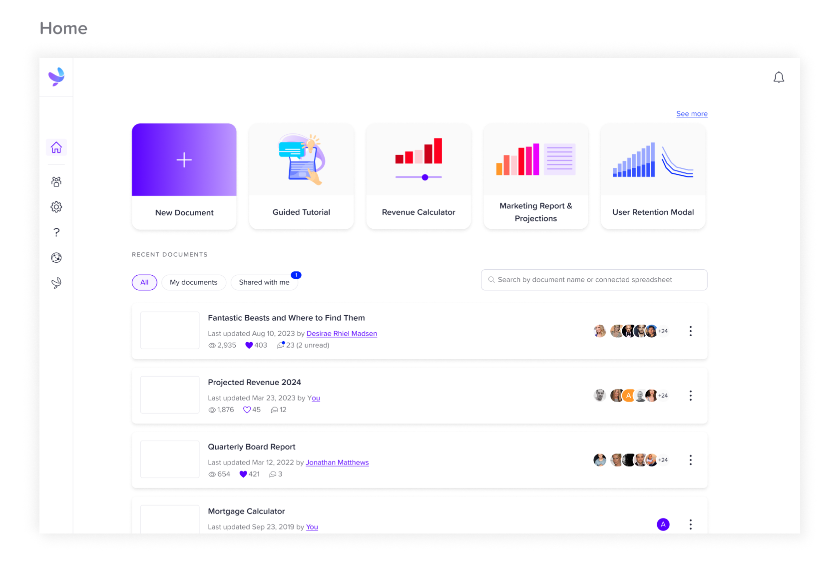
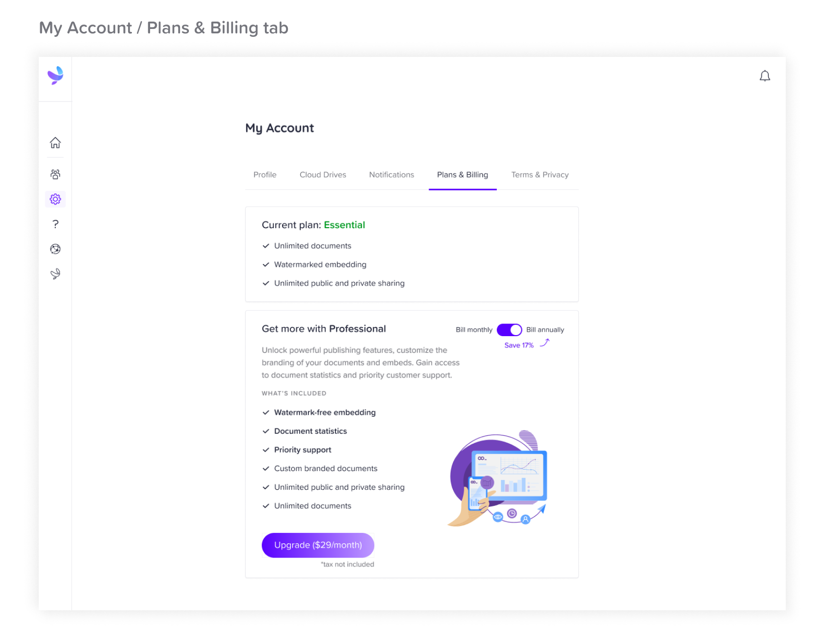
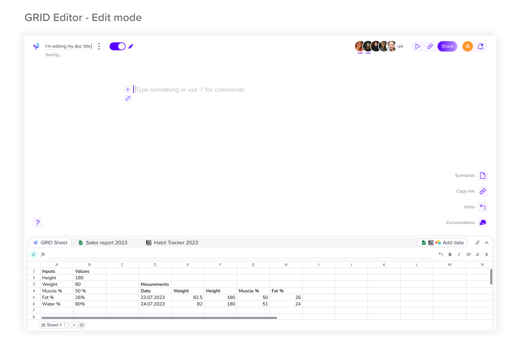
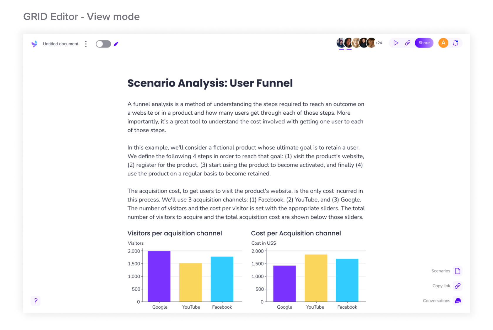
GRID offered some truly unique design challenges, many of which did not already have tried-and-tested design patterns established elsewhere. I loved collaborating on ideas across teams and then translating these ideas into visually appealing designs. I communicated design rationale clearly using prototypes and presentations, gaining buy-in and support for design decisions. And as the design team grew, I developed and helped implement the design system and design sharing processes to increase productivity, and ease collaboration.
The design process was iterative as we quantified the impact of design improvements in collaboration with the growth team, through metrics such as increased user engagement and improved conversion rates.
The result was a product that aligns more aesthetically with its target audience, with a look that sits comfortably alongside major platforms already adopted by our users such as Notion and Airtable. I helped develop an easy-to-use product that allows modern, non-technical knowledge teams to go beyond traditional spreadsheets - to create data narratives and conversations around their data, on a single, user-friendly surface.