I was asked to develop the typographic style for a series of short marketing videos for Travelex. The videos were animated by the very talented Alex Bam.
Using the initial storyboard sketches, I developed typographic routes that I felt best matched the look and feel of each individual video. Alex then took these and added his own illustrations before adding them to the finished animation.
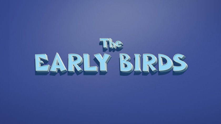
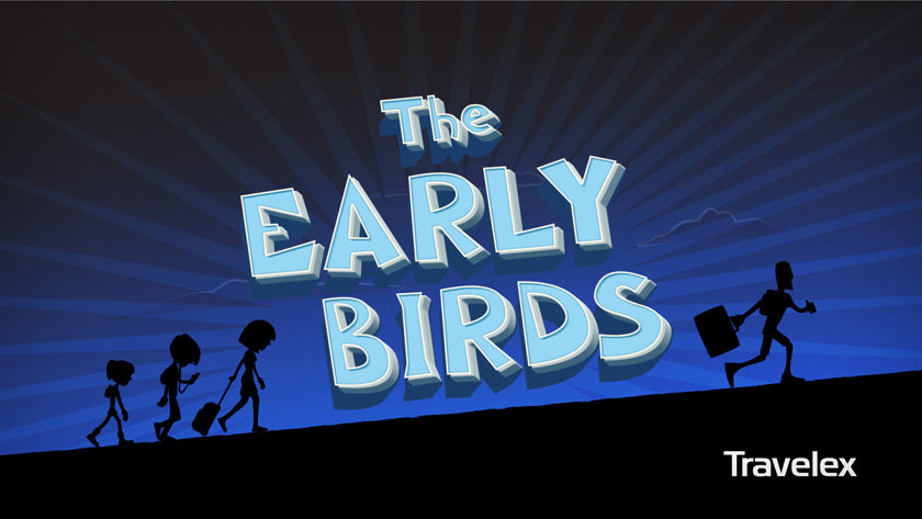
With ‘The Early Birds’ I went for a font that was lanky, a little frantic, and sort of gawky, which I felt matched the illustration style for this short video. The image below shows the finished title plate. See the final video here.
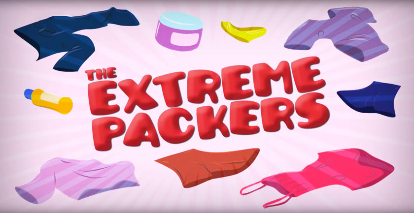
With ‘The Extreme Packers’ I created a bulging, bloated effect to correspond with the explosive suitcase seen in the final animation. There is also a slight leather texture to represent the clothes the characters might be packing.
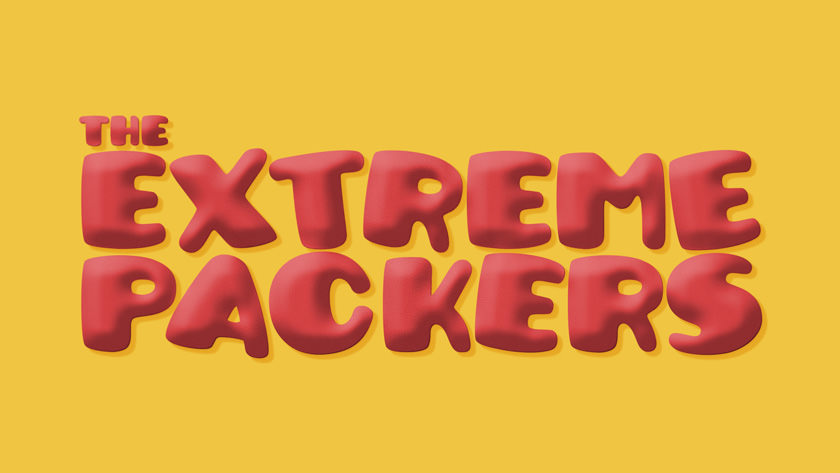
The image below shows the final title plate, with illustrations by Alex Bam.
For ‘The Perpetual Honeymooners’ I went for a slightly juicy/sticky look, all pink and candy flavoured. This route was inspired by the animation which shows two loved-up honeymooners faking their way to a more luxurious holiday.

The image below shows the final title plate, with illustrations by Alex Bam.

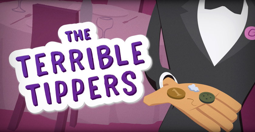
‘The Terrible Tippers’ video is about an older tourist couple who tip badly and end up getting a terrible table. With this in mind I wanted to create some type that communicated elements of farce and morality but keeping with the cartoon-style used in the rest of the series.

The image below shows the final title plate, with illustrations by Alex Bam.
Thanks again to Alex. He was a pleasure to work with.